bandoned Superhero Movie Designs

Superhero movies have come a long way from the days when the only way to sell the X-Men was to slap them into black leather bodysuits. Nowadays it seems any of the wildest costume creations from your favorite comics can be brought to beautiful life on the big screen. Of course, any movie of the scale of these superhero blockbusters is going to go through a lot of costume design concepts. Many of these end up being rejected. A lot have good reason for rejection. Some of these rejected designs, however, happen to be superior to the ones that end up making it to theaters. Sometimes the differences are absurdly dramatic.
Thanks to art books, “making of” documentaries and the internet, fans of superhero movies have more resources than ever to examine the process of making these movies. This list compiles 15 of the best pieces of superhero movie concept art with a focus on costuming and character design. These are costumes you’ll wish the studios went ahead and chose over the ones they ultimately went with. This doesn’t mean the final costumes were bad (though some certainly are). It just means there was a missed opportunity. When possible, this list does try to make sense of the reasons why these spectacular superhero and villain costume designs ultimately got scrapped. Due to production shifts or practical limitations, it might not have been reasonable or even possible for some of these designs to get used. Still, that doesn’t mean we don’t wish they could have been!

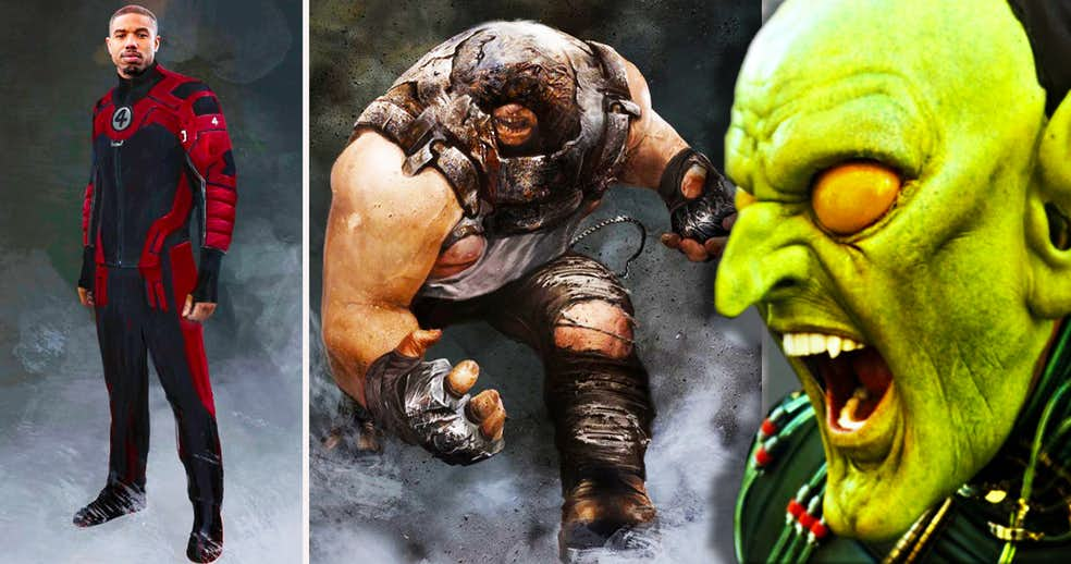
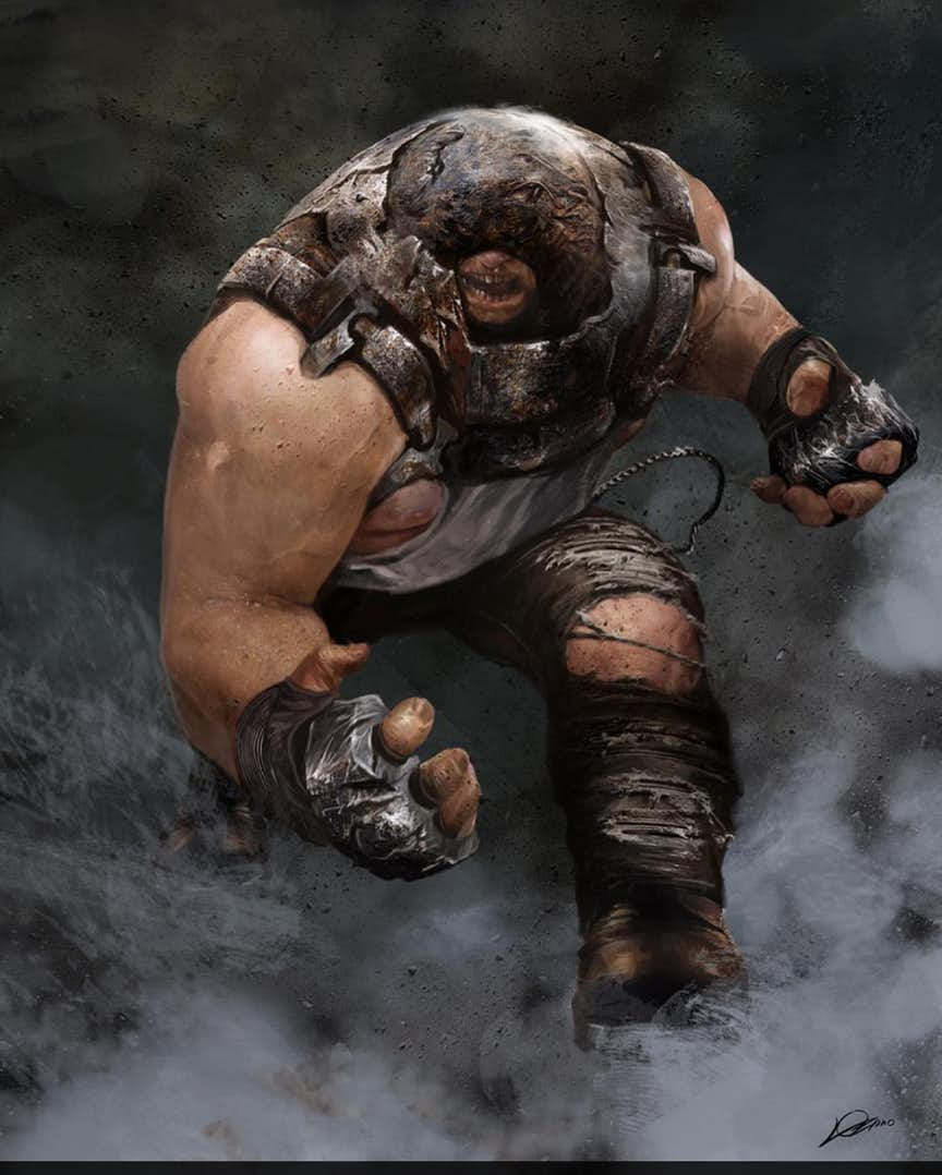
Juggernaut’s design in David Leitch’s final version of Deadpool 2 was certainly a massive improvement over whatever Brett Ratner was thinking with the character in X-Men: The Last Stand. That said, it could have been even better. Just look at what Alexander Lozano was designing for original director Tim Miller.
This concept art of Juggernaut has similar proportions to the final version, but a notably different costume. Not dressed in a prison uniform like in the movie, his costume’s color scheme is closer to the comics. His clothes and helmet are more worn and beaten, and he’s also armed with metal gauntlets.
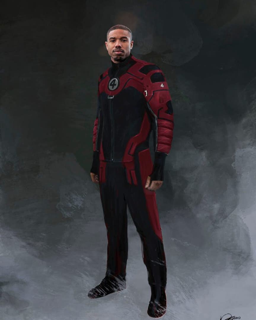
What to do with the Fantastic Four? The answer to this question has elluded FOX for the longest time. One potential answer which was shortly scrapped: put them in Deadpool 2. Alexander Lozano’s concept designs for Tim Miller’s version of the sequel featured new, more classically-styled costumes for the cast of Josh Trank’s 2015 Fantastic Four feature.
Perhaps the bomb stink from that disaster was just so toxic it was decided not even Deadpool could save that cast, or maybe putting generally family-friendly characters in a hard R movie was frowned upon. Regardless of how these cameos would have turned out, however, odds are good they’d be the Four’s best on-screen appearance.

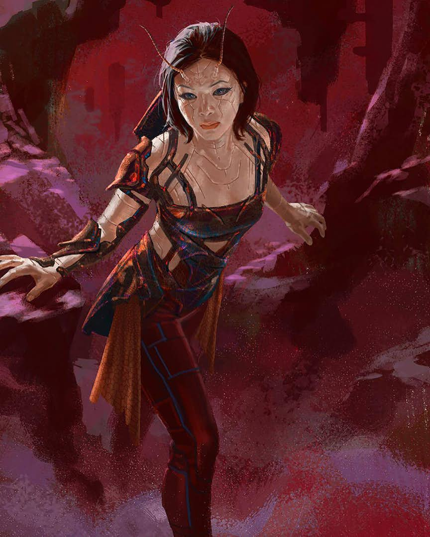
Mantis’ design for Guardians of the Galaxy 2 was a challenge to figure out. The character was wildly different from her comic counterpart, and her green skin from the comics was scrapped probably because they already had a green Guardian with Gamora. Trying to find the perfect balance between insectoid alien features and human attractiveness was the goal for designing her.
Ultimately the final movie design is great, and this is one case where the difference in quality between the concept vs. the final product isn’t that great. This Andy Park design, however, is worth highlighting as an example of a design that still manages to be attractive while being even more alien than the final.
